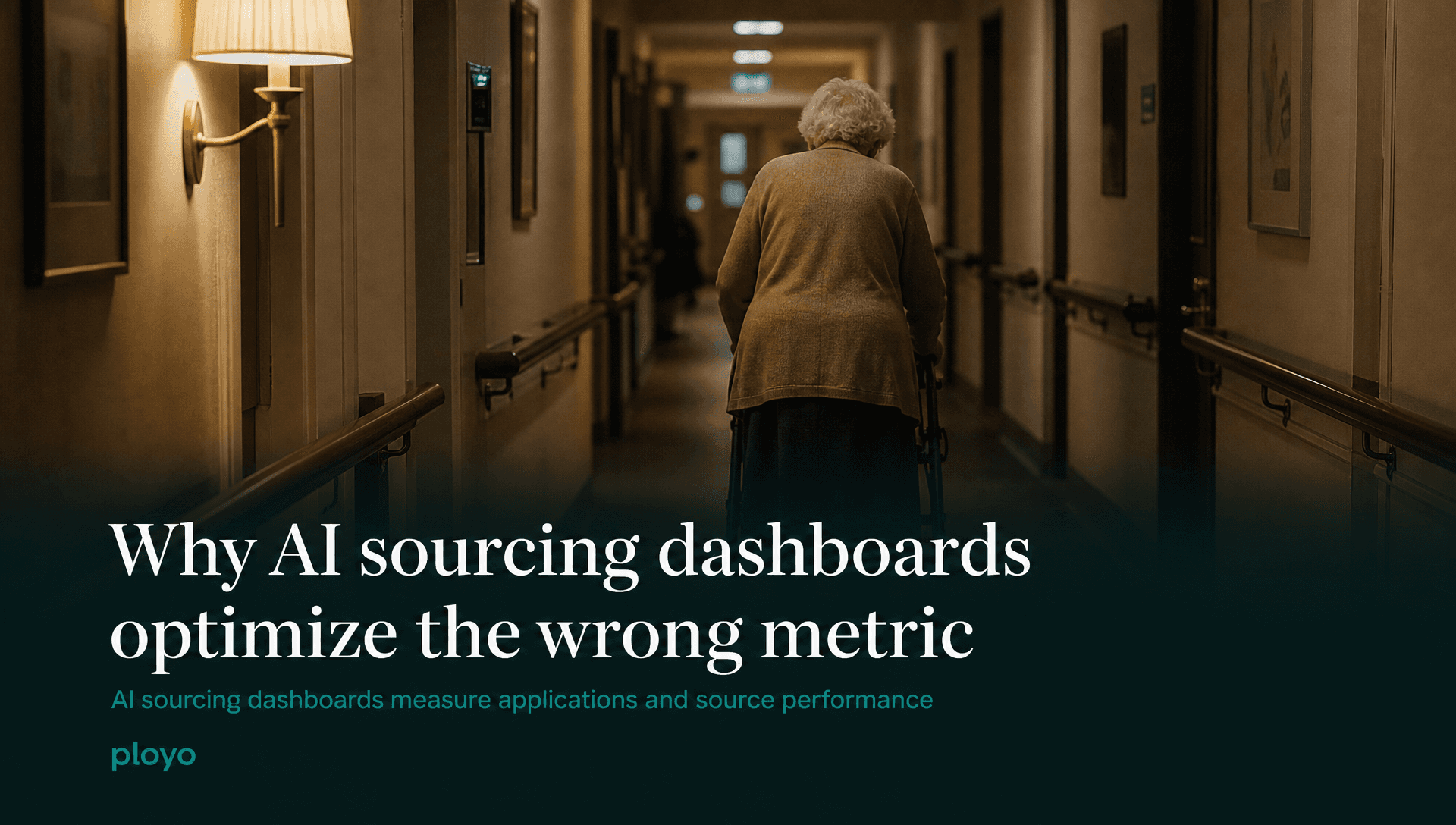
Why AI sourcing dashboards optimize the wrong metric
AI sourcing dashboards measure applications and source performance. They miss whether your team can screen candidates before they accept another offer.
Ployo Team
Ployo Editorial
Your AI sourcing dashboard is probably reporting good news about the wrong problem. Applications up, channels diversified, cost per applicant holding steady. The numbers look strong. Your hire rate is still disappointing and your time to offer is still too long.
The dashboard is not broken. It is measuring the wrong stage.
What AI sourcing dashboards actually measure
AI sourcing dashboards track the top of the recruiting funnel: how many candidates entered your pipeline, from which channels, at what cost per application, and how quickly they arrived after a role was posted. Some extend into early engagement, whether the candidate completed the application, whether they opened an outreach message, whether they clicked through.
These are input metrics. They measure the act of finding candidates. They do not measure what happens to those candidates once they arrive.
Most sourcing dashboards do not show: how many candidates were actually assessed, how long assessment took, what proportion were screened before they took another offer, or which source channels produce candidates who pass a qualification screen at a useful rate. The gap between "candidates applied" and "candidates assessed" is where most high-volume pipelines lose both time and people, and most sourcing tools have nothing to say about it.
The real bottleneck is not sourcing
In most high-volume roles, including care and support work, retail, logistics, and contact centre, applications are not the scarce resource. A single job post on a major board typically generates more applications than a small recruiting team can realistically screen. The problem is not finding candidates; the constraint is qualifying them before those candidates accept something else.
A recruiter conducting 30-minute phone screens on 200 applications for 20 hires is spending 100 hours a month on first-stage assessment alone. A sourcing tool that raises the application count to 250 has made the actual problem harder. The dashboard shows an improvement. The recruiter's week looks exactly the same.
This is the structural blind spot in most AI sourcing dashboards. They measure volume at the entry point, which reads as success, without connecting that volume to whether the team can convert it into assessed, shortlisted candidates before candidates move on. In any sector where good candidates hold multiple live offers, that conversion window is short and it closes fast.
For hiring teams running aged care or disability support recruitment at scale, this gap is particularly sharp. A support worker who applies on Monday and hears nothing by Thursday has, in most markets, accepted another role by then. A sourcing dashboard showing 200 applications that week does not tell you how many of those candidates were still available when your team reached them.
Why sourcing volume without screening capacity creates waste
A sourcing pipeline that brings in more candidates than you can screen is not a stronger pipeline. It is a longer queue. In a market where qualified candidates have options, a longer queue means more of the people worth shortlisting leave before you get to them.
The effect shows up in a metric most sourcing dashboards do not track: quality-of-source by stage conversion. Channel A produces 80 applicants, 14 of whom pass a requirements screen. Channel B produces 40 applicants, 24 of whom pass. By raw application count, Channel A appears more productive. By qualified candidate yield, Channel B generates nearly four times more. That calculation requires both the application count and the screen-pass rate, and most dashboards only give you the first number.
Connecting sourcing to screening outcomes is what proper candidate screening software makes possible. When every applicant receives a structured assessment as a matter of course, the data exists to compute quality-of-source by stage rather than by volume. Sourcing budget then flows toward channels that produce screened candidates, not just candidates.
What a more useful funnel metric looks like
The metric that predicts hiring outcomes is funnel conversion at each stage: how many applicants became screened, how many screened became shortlisted, how many shortlisted received offers, how many offers became hires.
Each stage conversion is diagnostic. A low application-to-screen conversion usually means either that the requirements are wrong (candidates who could do the job are not making it through) or that screening capacity is wrong (qualified candidates are not being reached in time). Both are fixable, but only if the number exists.
A low screen-to-shortlist conversion usually points to source quality. The channels are generating applicants who cannot meet role requirements. Adding applications from those same channels makes it worse.
If you are evaluating AI sourcing dashboards, ask every vendor what data their reports connect sourcing activity to. If the answer stops at application count or engagement rate, you are looking at a map of the road into your funnel. That is useful; it is not enough. For practical guidance on building a structured qualification process that generates these stage metrics from the start, the NDIS support worker recruitment guide covers requirements-based screening in a context where qualification is compliance-critical and speed still matters.
What are AI sourcing dashboards? AI sourcing dashboards are analytics tools that track where job candidates come from, how fast they arrive, and what each application costs. They are designed to optimise the top of the recruiting funnel and are generally good at that. Their gap is that they rarely connect sourcing activity to screening or hiring outcomes.
Why don't sourcing dashboards show screening performance? Most sourcing tools are built by teams focused on candidate acquisition, not candidate selection. They hold data on what happens before a candidate enters a human screening process. Connecting that to screening outcomes requires integrating across tools and teams that often sit in different parts of the organisation and do not share data by default.
What should high-volume hiring teams track instead? Stage-by-stage funnel conversion: the proportion of applicants who become screened candidates, screened candidates who become shortlisted, shortlisted candidates who receive offers, and offers that convert to starts. Quality-of-source by stage tells you which channels produce candidates who can actually do the role, which is a different question from which channels produce the most applications.
Sourcing dashboards are a useful map of the road into your funnel. They tell you almost nothing about what happens once candidates arrive. If your sourcing numbers look strong and your hire rate is still underperforming, you are almost certainly looking at the wrong stage.
Ahmed Raza, co-founder, Ployo